Ideas
S2C
24 June 2004 | |||
|
Ok, here's the deal. Tonight I came home and had the image for the new
website layout in my head but I was missing the icon/image to replace
the old combo images in the upper left corner. I knew I wanted to get
rid of the top frame and banner page that was in it but I didn't want
people to miss the site's name always being visible. Since my sister is far more artistically inclined than I am and more familiar with image manipulation I asked her to create my new logo. After about 2.5 hours of fiddling with it and my constant annoying feedback, she had created the logo you see before you now. At first I felt there was something not quite right but I couldn't put my finger on it. Now that it is in the right context though, I think her judgement was quite sound. It does look pretty "schway", awesome, bongo, rad, etc etc etc. | |||
21 March 2004 | |||
 | |||
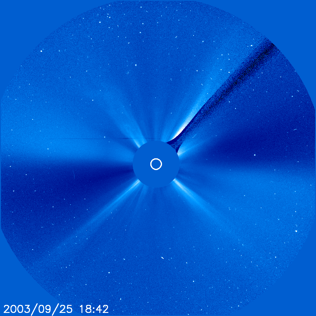
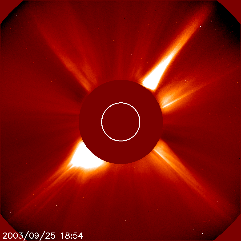
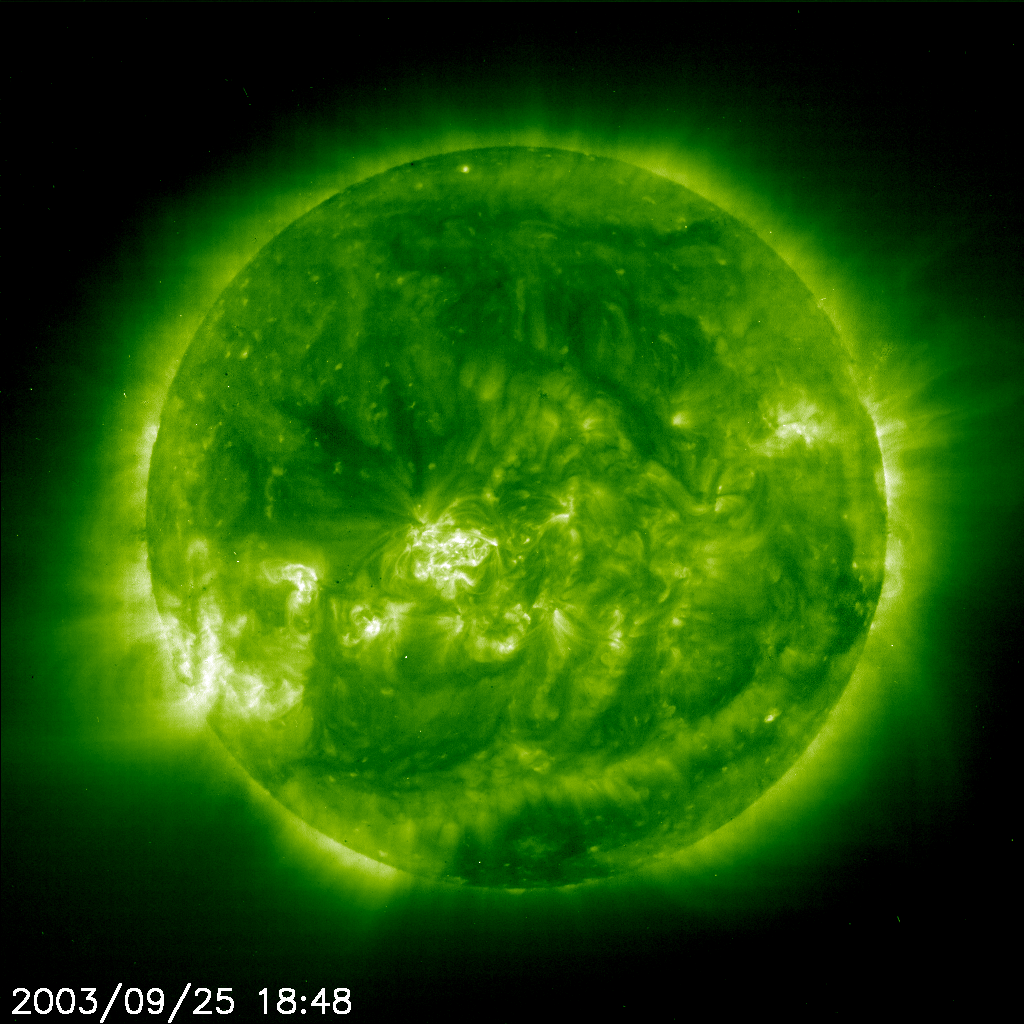
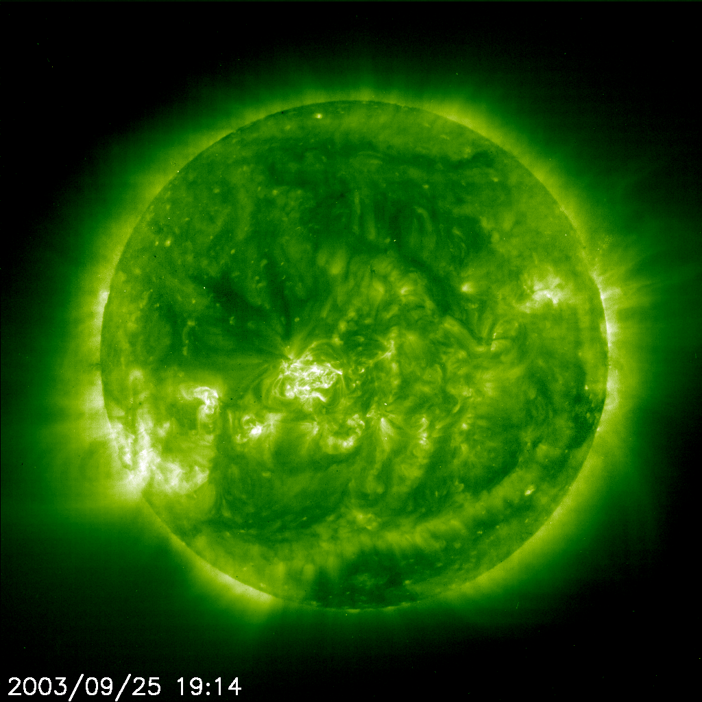
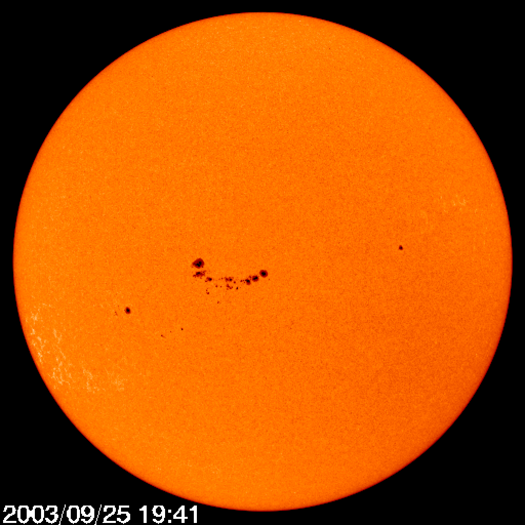
25 September 2003 | |||
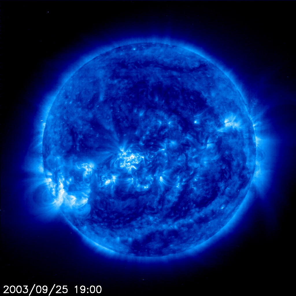
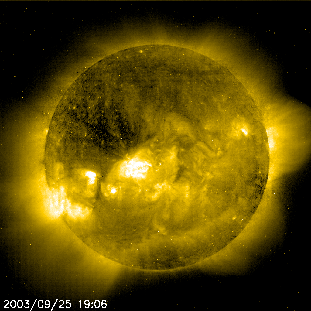
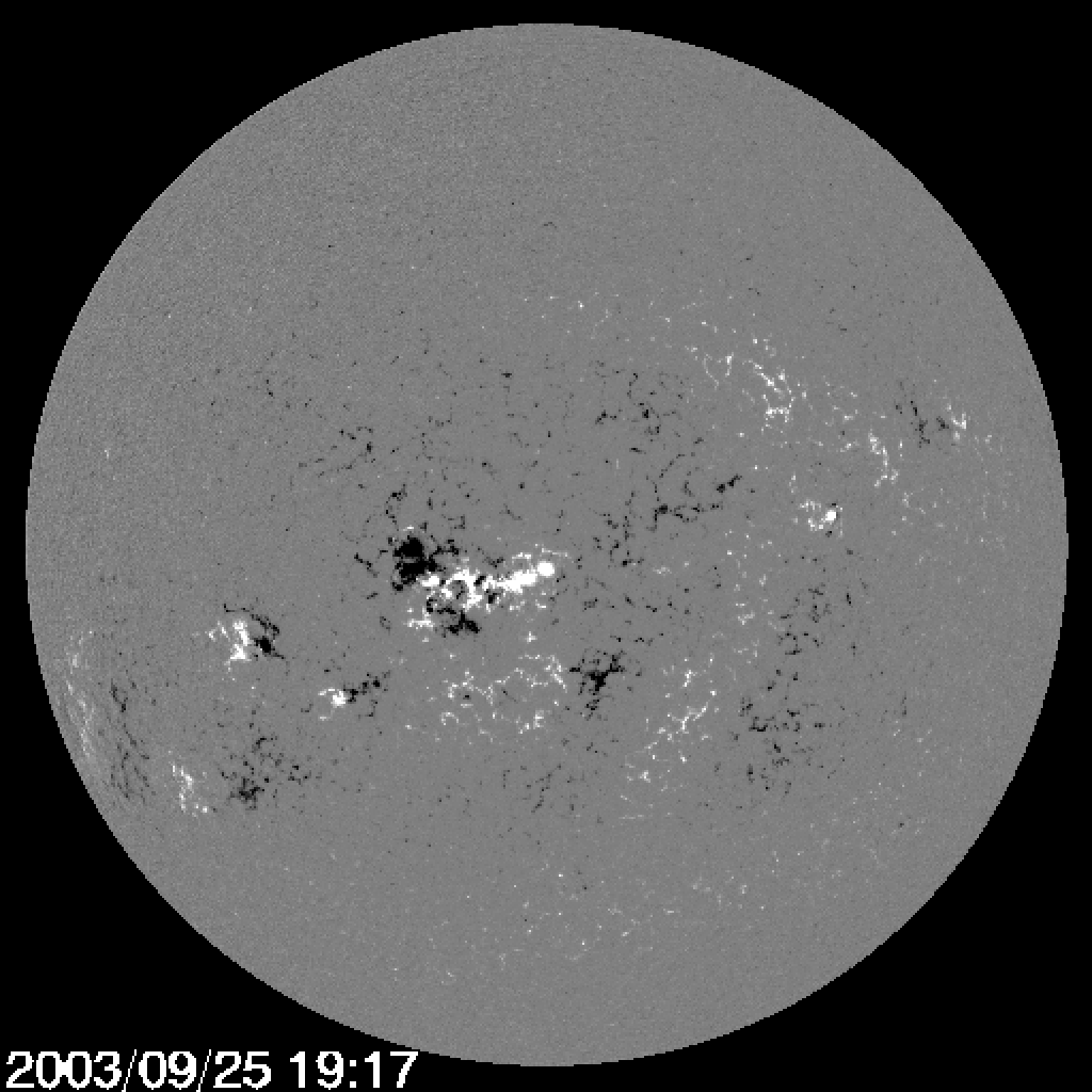
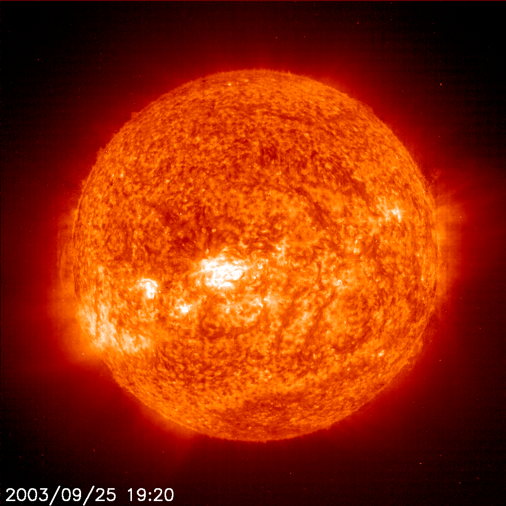
All these images are from SOHO around 1900 (7pm) 20030925_1842_c3 20030925_1854_c2 20030925_1848_eit_195 20030925_1914_eit_195 20030925_1900_eit_171 20030925_1906_eit_284 20030925_1917_mdi_mag 20030925_1920_eit_304 20030925_1941_mdi_igr | |||
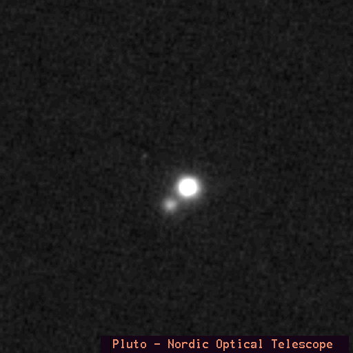
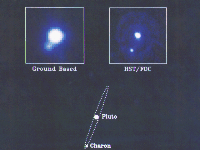
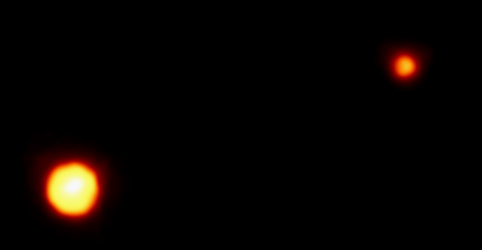
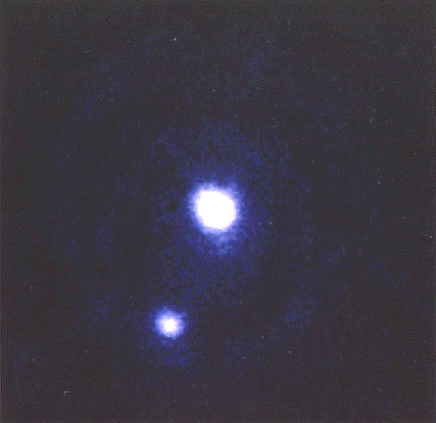
1994 Hubble et.al. | |||
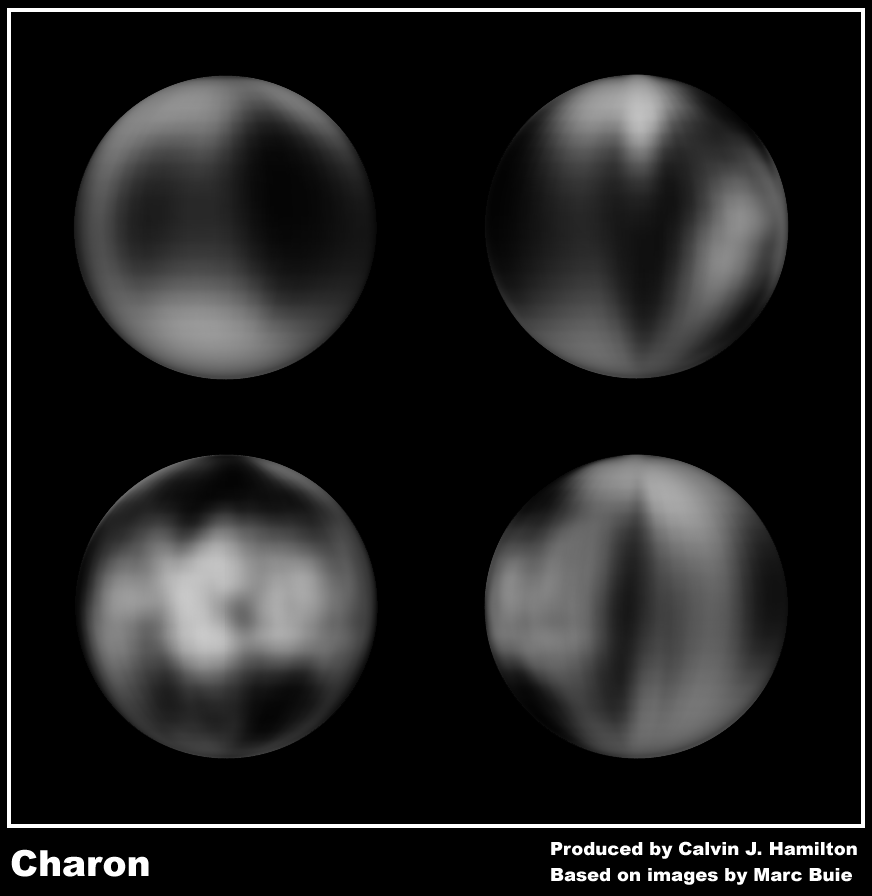
These images are from various sources plutonor pluto 1994-17-a-full_tif pluto_c charon Before you start thinking these pics are seriously poor in comparison to the Solar pics, keep in mind that the moon, Charon, is smaller than the eastern half of the US and is nearly 40 times farther away than the sun, which is hundreds of times larger than earth. One site likens trying to see Pluto to trying to see a baseball 40 miles away. And Charon is roughly half Pluto's size so it's more like a golf ball from 40 miles away. | |||

